Energy management SaaS · Web app
Cenergistic Measure
A data-heavy energy-management platform whose interface needed to turn dense, technical data into something modern and genuinely readable.
- My role
- UX / UI Designer
- Contribution
- Information architecture, interface design, and design-system QA
- Timeline
- 2020 – 2025 · ongoing platform updates
- Platform
- Web application
- Tools
- Figma, Figma Make, Claude, Illustrator
The redesign at a glance
Before & after
The problem
Cenergistic Measure is the web platform energy specialists use to track building energy performance for their clients — districts and organizations managing dozens or hundreds of buildings. It handles a lot: consumption and savings trends, utility-bill entry and correction, meter configuration, and the conservation measures that drive results.
All of that depth is the point — but depth without hierarchy is just noise. The real challenge wasn’t simplifying the data, it was taking dense, technical data and turning it into a modern interface analysts could actually read.
From requirements to interface
Each screen started from technical requirements — what data it had to handle and what users needed to do with it. My job was to take those requirements, and the raw data behind them, and shape them into something clear and modern. I built the screens in Figma and iterated with the product team there, going back and forth until the layout and hierarchy held up.
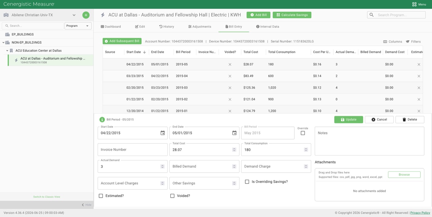
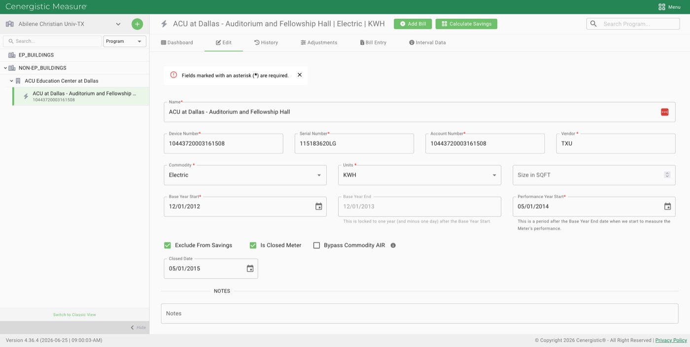
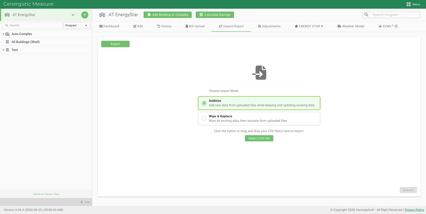
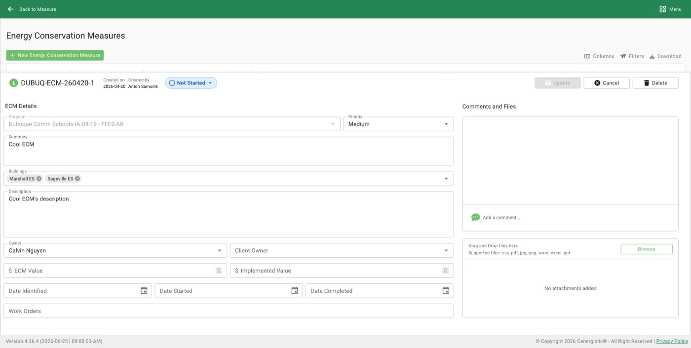
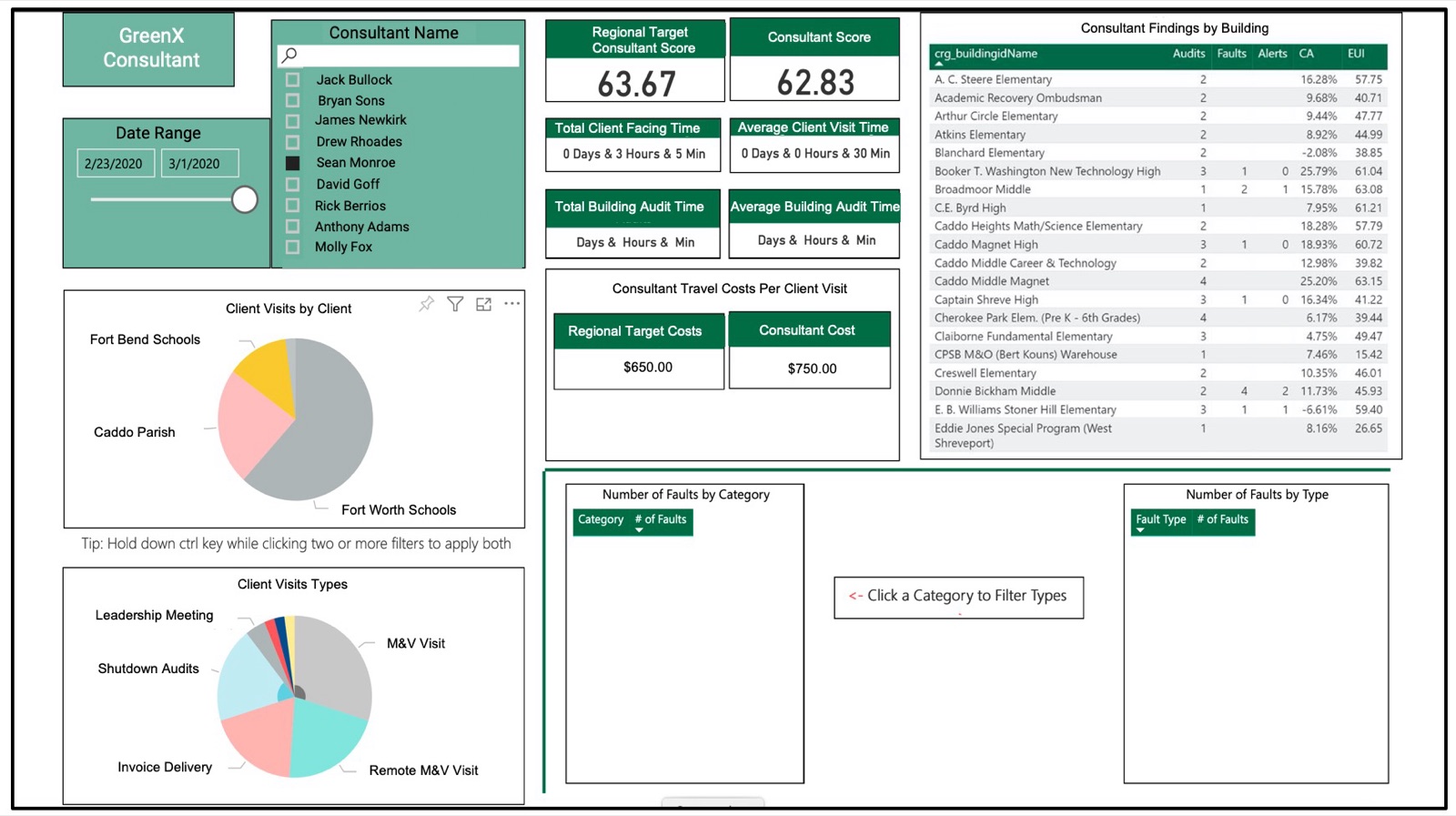
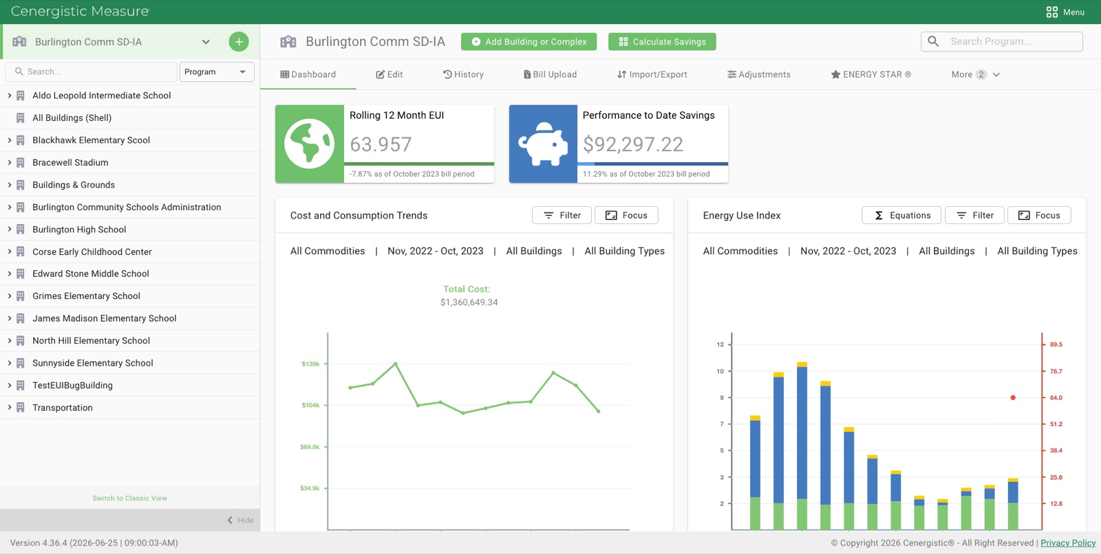
The before and after above is the clearest example: the same dense dashboard data, restructured so the headline metrics — Rolling 12-Month EUI and Performance-to-Date Savings — lead, the building list stays calm and scannable, and the charts share one consistent pattern. From there, the same system carried across the working screens: bill entry, meter setup, import/export, and conservation-measure tracking.
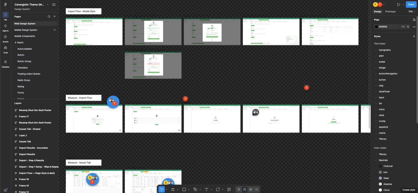
Inside the Figma file: the Cenergistic design system — named type and color styles (Charcoal, Iron, Steel, Abalone, Cloud), a component library, and rows of in-progress frames where the Import Flow was worked out before anything reached the final screens.
Staying inside the design system
A lot of this work moves fast — designing in Figma, using Figma Make and Claude to get from idea to screen quickly. That speed is a real advantage, but it comes with a catch I’ve learned not to ignore: AI doesn’t keep your design system for you.
Generated screens look finished, but they drift — an off-spec color, a button radius that’s slightly wrong, a component that’s almost the right one. So every screen I produce gets a manual pass against our design system before it goes anywhere near engineering. I’m checking components, spacing, type, and color against the system itself — not against “does this look fine.”
That discipline matters because inconsistency is expensive downstream. Handing the dev team a screen that quietly breaks the system hands them ambiguity — which token, which component, which spacing is right? Catching it at the design stage keeps the system intact and keeps engineering moving. Fast prototyping only works when someone is still accountable for consistency, and on these screens that’s me.
Reflection
The biggest takeaway for me was that clarity in a data-dense product isn’t about removing information — it’s about ranking it. The same content, given a clear hierarchy and a consistent system, went from overwhelming to readable.
Final screens