Energy management SaaS · Mobile app
Cenergistic Executive
Executives needed a fast, high-level read on energy savings across a large portfolio — something the full desktop platform was never built to give them on the go.
- My role
- UX / UI Designer
- Contribution
- Workflow design, interface design, and design-system QA
- Timeline
- 2024
- Platform
- iOS & Android app
- Tools
- Figma, Figma Make, Claude, Illustrator
The problem
Cenergistic Executive is the mobile companion to the Measure platform. Where the web app is built for analysts working in depth, executives need the opposite: not every chart and table, but the handful of numbers that tell them whether the energy program is working — total cost avoidance, performance, and audit status across the entire portfolio.
The full platform was never meant to deliver that in thirty seconds on a phone. The job was to distill it: take a sprawling, data-rich product and surface just the executive-level signal, readable at a glance.
From requirements to interface
Like the web app, each screen started from what executives actually needed to know, then took shape in Figma and iterated with the product team. The design question wasn’t “what can we show” — it was “what’s the one thing they open this app to see, and how does everything else support it?”
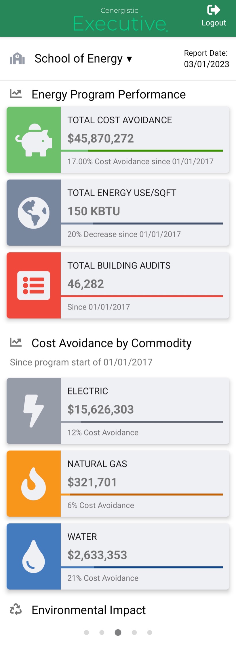
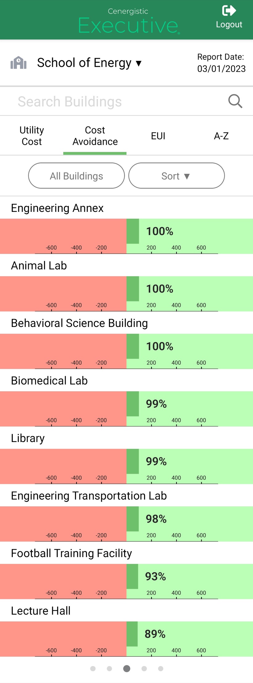
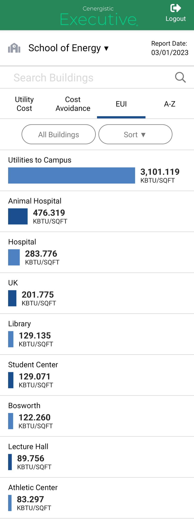
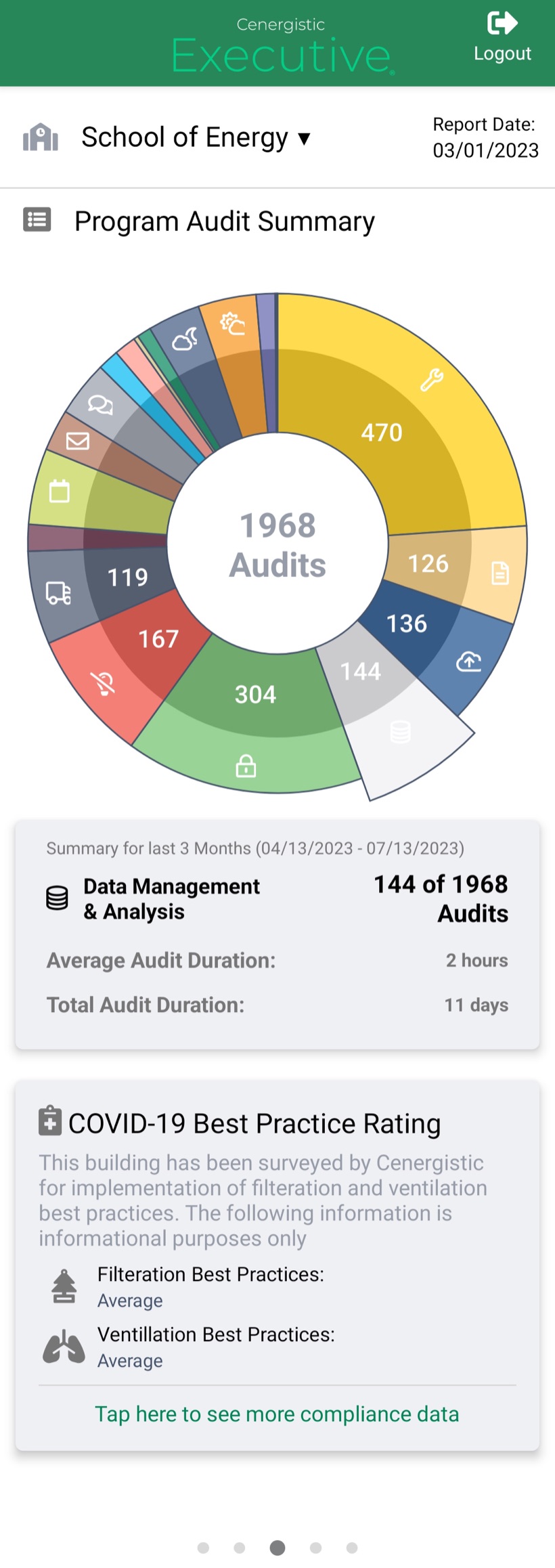
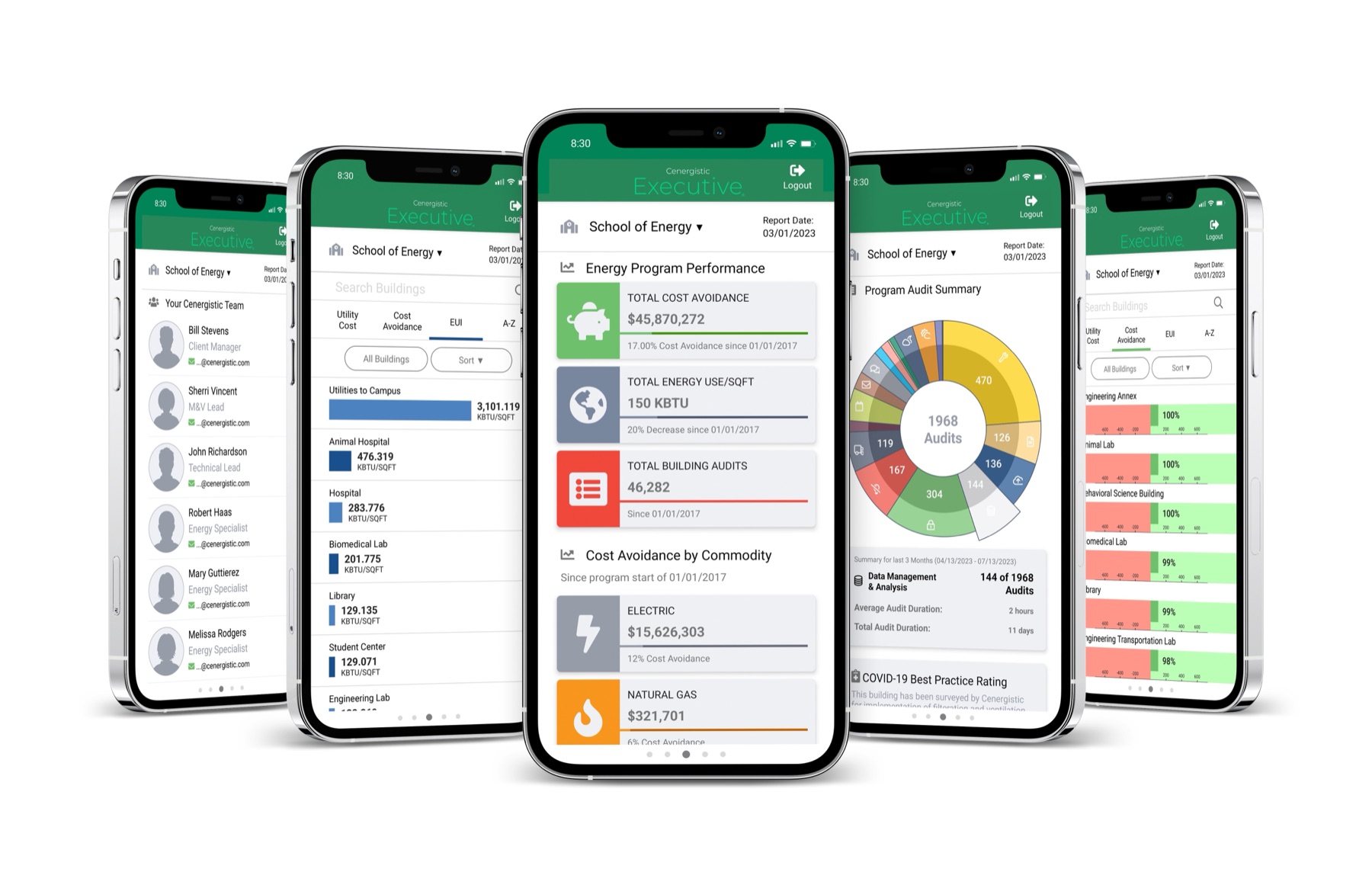
That led to a card-based hierarchy: the headline number — portfolio-wide cost avoidance — leads, with performance, energy use, and audit summaries arranged beneath it as glanceable cards. Each screen answers one question quickly, then gets out of the way.
One design system, two platforms
The Executive app shares the same Cenergistic design system as the Measure web platform — the type styles, color tokens, and components live in one Figma file, with a dedicated mobile component set. That shared foundation is what keeps the two products feeling like one suite instead of two disconnected apps.
It also carries the same discipline: designing fast with Figma, Figma Make, and Claude is a real speed advantage, but AI doesn’t enforce the system on its own. I review every screen for consistency — components, spacing, type, and color — against the system before it reaches engineering, so the mobile app stays true to the same standard as the web platform.
Reflection
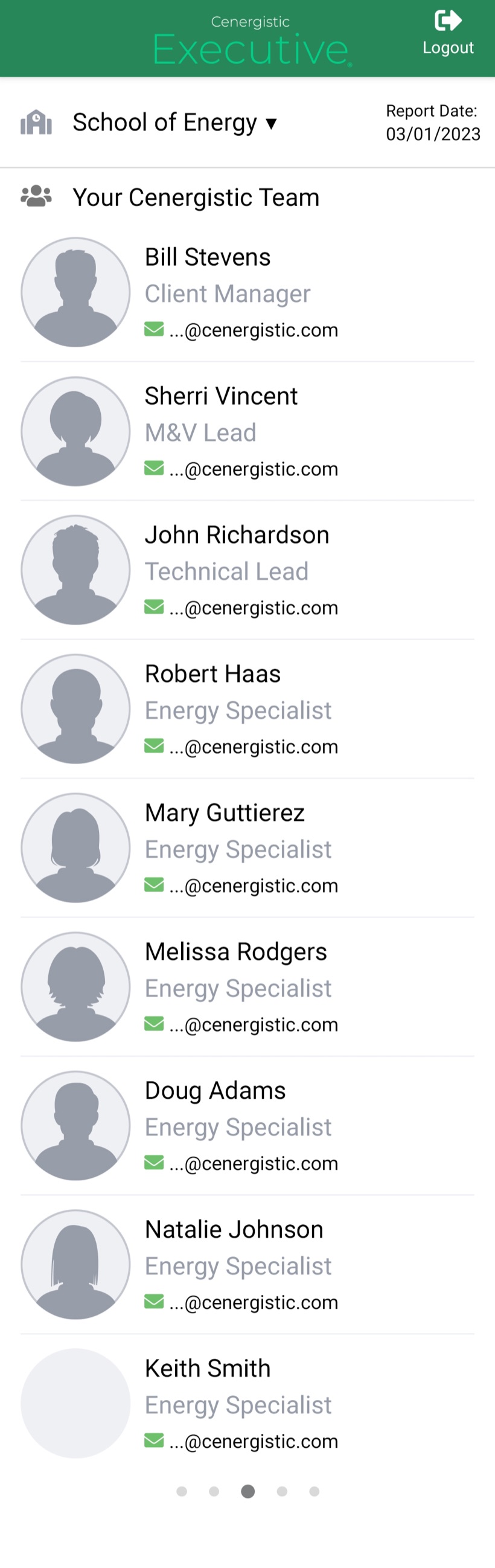
Cenergistic Executive started as a streamlined version of the Measure and GreenX platforms — distilled down to an executive overview of an energy program. Because it’s built for quick reading, the interface leans on swipe gestures to move between views and surface information fast.
The detail that surprised me most was color. To keep everything readable at a glance, I had to expand the software color palette well beyond what the web platform needed — enough distinct, legible colors to carry all the data the executive views present. Otherwise the app stays close to home: it shares much of its foundation with our main design systems, including Font Awesome icons alongside custom icons I created in-house.
Final screens